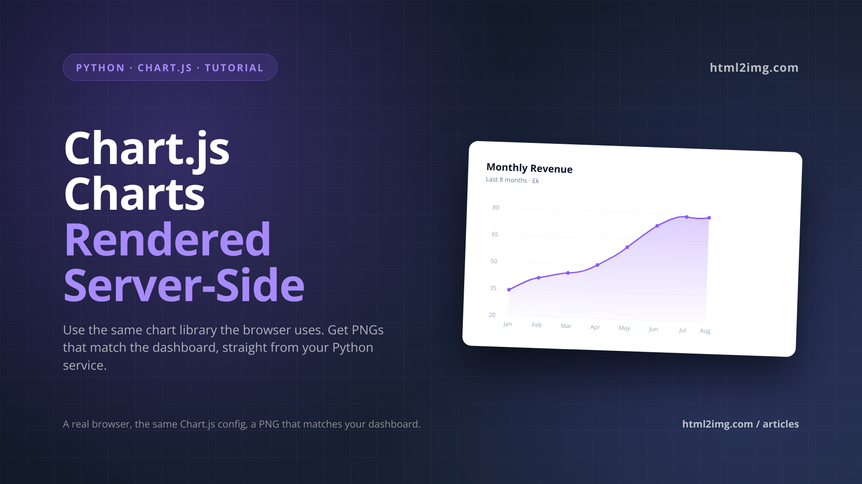
I needed weekly performance reports emailed to clients. Each report had four charts: revenue trend, conversion rate, top products, traffic sources. The app was Python. The charts on the live dashboard were Chart.js because that's what the frontend team had standardised on, and they looked good.
First attempt was matplotlib. It produced charts. They looked like matplotlib charts, which is to say fine for a scientific paper and terrible for a client email that's supposed to match the product's visual language. The brand colours were approximate. The fonts were wrong. The legend looked like it was from 2008. Clients politely asked why the emailed reports didn't match the dashboard.
Second attempt was chartjs-node-canvas. This works by running Chart.js against a Node canvas polyfill. Close to the real thing, but not identical. Gradients rendered differently. Some plugins didn't work at all. And now I was running a Node service from Python for one specific job, which felt wrong.
What actually solved it was Chart.js server-side rendering, where "server-side" means a real browser on someone else's server. I generate the HTML for the chart, including the Chart.js script tag and the config, post it to a rendering API, and get back a PNG that matches what the dashboard shows exactly, because it's the same Chart.js code running in the same browser engine. This article is how I set that up from Python, and the small details that make the difference between a chart that looks right and one that doesn't.
Why the obvious Python chart options fall short
Matplotlib and Plotly both generate images natively from Python. They're fine tools. The problem is that if your product uses Chart.js (or D3, or Recharts, or ApexCharts) on the frontend, and you want emailed or PDF-embedded charts to match, you're re-implementing the same visual twice in two different libraries. Colours drift. Fonts drift. Tooltip styling is irrelevant for a static image but the overall look and feel stops matching.
Plotly can export as a PNG via its kaleido backend, which is better, but you're still maintaining two chart implementations. Any change to the dashboard's chart styling means a matching change to the Python-side Plotly code, and keeping those in sync is a perennial source of bugs.
chartjs-node-canvas gets you one library, but at the cost of running Node from Python and accepting that canvas-polyfill rendering isn't pixel-perfect against real browser canvas. Gradients, shadows, and certain plugin behaviours differ. For anything that'll sit next to the "real" chart in a client's inbox, close-but-not-quite is worse than obviously-different.
The approach that actually gives you matching output is to render the chart in a real Chromium instance. Chart.js draws to a canvas, you screenshot the canvas, done. Running that browser yourself brings all the Puppeteer-on-a-server problems: binary size, version drift, memory. Pointing at an API that does it for you removes the problem entirely.
The setup
Here's a working Python function that takes a chart config and returns PNG bytes. The chart config is a plain dict that matches Chart.js's config shape, which means you can either write it by hand in Python or fetch it from wherever your frontend gets its config from and reuse it directly.
import os
import json
import requests

HTML2IMG_URL = "https://api.html2img.com/v1/render"
API_KEY = os.environ["HTML2IMG_API_KEY"]


def render_chart(config: dict, width: int = 800, height: int = 450) -> bytes:
    """Render a Chart.js config as PNG bytes."""
    html = f"""
    <!DOCTYPE html>
    <html>
    <head>
      <meta charset="utf-8">
      <style>
        html, body {{ margin: 0; padding: 0; background: white; }}
        body {{
          width: {width}px;
          height: {height}px;
          font-family: -apple-system, "Segoe UI", system-ui, sans-serif;
          padding: 24px;
        }}
        #chart {{ width: 100%; height: 100%; }}
      </style>
      <script src="https://cdn.jsdelivr.net/npm/[email protected]/dist/chart.umd.min.js"></script>
    </head>
    <body>
      <canvas id="chart"></canvas>
      <script>
        const ctx = document.getElementById('chart').getContext('2d');
        const config = {json.dumps(config)};
        config.options = config.options || {{}};
        config.options.animation = false;
        config.options.responsive = false;
        config.options.maintainAspectRatio = false;
        const chart = new Chart(ctx, config);
        window.__chartReady = true;
      </script>
    </body>
    </html>
    """

    response = requests.post(
        HTML2IMG_URL,
        headers={
            "Authorization": f"Bearer {API_KEY}",
            "Content-Type": "application/json",
        },
        json={
            "html": html,
            "viewport_width": width + 48,
            "viewport_height": height + 48,
            "device_scale_factor": 2,
            "wait_for_selector": "#chart",
            "ms_delay": 400,
        },
        timeout=30,
    )
    response.raise_for_status()
    return response.content
Three things in that HTML are worth calling out because they're the difference between a chart that renders and one that doesn't.
animation = false disables Chart.js's entrance animation. The screenshot fires as soon as the chart is ready, and you don't want to capture it mid-fade-in. responsive = false and maintainAspectRatio = false force the chart to use the exact canvas size you set, rather than trying to resize relative to its container. ms_delay: 400 gives Chart.js a moment to finish drawing after the canvas appears in the DOM. You could be more precise by having the page set a sentinel element when the chart is drawn and waiting for that selector, but a small delay is usually sufficient.
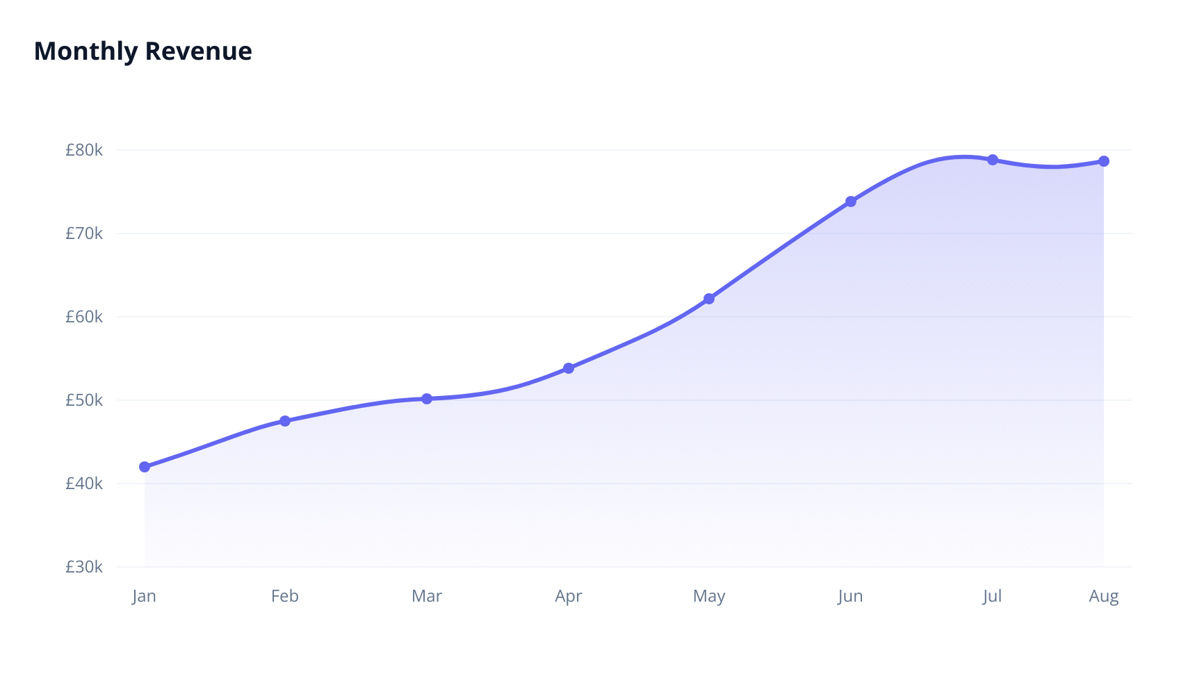
Now using it for a revenue trend chart:
revenue_config = {
    "type": "line",
    "data": {
        "labels": ["Jan", "Feb", "Mar", "Apr", "May", "Jun", "Jul", "Aug"],
        "datasets": [{
            "label": "Revenue",
            "data": [42000, 48500, 51200, 55800, 61300, 68900, 72400, 79200],
            "borderColor": "#6366f1",
            "backgroundColor": "rgba(99, 102, 241, 0.12)",
            "fill": True,
            "tension": 0.35,
            "pointBackgroundColor": "#6366f1",
            "pointRadius": 4,
            "borderWidth": 3,
        }],
    },
    "options": {
        "plugins": {
            "legend": {"display": False},
            "title": {
                "display": True,
                "text": "Monthly Revenue",
                "font": {"size": 18, "weight": "700"},
                "color": "#0f172a",
                "align": "start",
                "padding": {"bottom": 20},
            },
        },
        "scales": {
            "y": {
                "beginAtZero": False,
                "grid": {"color": "#f1f5f9"},
                "ticks": {
                    "color": "#64748b",
                    "callback": "function(v) { return '£' + (v/1000) + 'k'; }",
                },
            },
            "x": {
                "grid": {"display": False},
                "ticks": {"color": "#64748b"},
            },
        },
    },
}

png_bytes = render_chart(revenue_config, width=800, height=450)

with open("revenue.png", "wb") as f:
    f.write(png_bytes)
One wrinkle: the callback function for the y-axis ticks is expressed as a string. JSON can't hold JavaScript functions, so if you need them, you serialise the config, then have a post-processing step that replaces string function placeholders with real function literals. Here's a tiny helper that does that:
import re

def build_html_config(config: dict) -> str:
    """Serialise a config dict, unwrapping string-encoded JS functions."""
    json_str = json.dumps(config)
    # Match "function(...) { ... }" inside JSON strings and unquote them
    return re.sub(
        r'"(function\s*\([^)]*\)\s*\{[^}]*\})"',
        lambda m: m.group(1).replace('\\"', '"'),
        json_str,
    )
Then in the HTML template, replace JSON.stringify(config) with the output of build_html_config(config). For simple charts that don't need formatter callbacks, you can skip this and pass config straight through.
Below is what we're rendering:
Gotchas worth knowing
Chart.js versions matter. The config shape changed significantly between v2 and v3, and again in a smaller way for v4. Pin the CDN URL to a specific version so your server-side renders don't suddenly break when the chart library publishes a release. The example above pins to 4.4.0.
Canvas text rendering is affected by fonts being available at the time of draw. If your chart uses a custom font via font.family, that font needs to either be a system font, be loaded before Chart.js runs, or you accept a fallback. The cleanest pattern is to include @font-face in the <style> block and reference the same font both in CSS and in the Chart.js config. Then bump ms_delay to 500-700ms to be safe.
Plugins that need DOM interaction, like the chartjs-plugin-datalabels click handlers or zoom plugins, are irrelevant for a static image and should be omitted from the server-side config even if your frontend uses them. Anything that only affects hover or click state is wasted computation.
For reports with multiple charts, render them in parallel. The API calls are independent, so concurrent.futures.ThreadPoolExecutor with a handful of workers cuts report generation time substantially:
from concurrent.futures import ThreadPoolExecutor

configs = [revenue_config, conversion_config, products_config, traffic_config]

with ThreadPoolExecutor(max_workers=4) as pool:
    images = list(pool.map(render_chart, configs))
For truly bulk runs (hundreds of charts per report, or reports generated on a schedule for thousands of accounts), switch to the webhook pattern. You post each render with a webhook_url, the API calls your endpoint with the finished PNG, and you don't hold threads open waiting. For a weekly-report system, that's usually the right shape.
One last thing: don't inline base64 PNGs into emails if you can avoid it. Host the PNG somewhere (S3, a signed CDN URL, your own storage) and reference it in the email HTML. Email clients handle external images more reliably than inline attachments, and the email itself stays small.
The Python usage guide covers the requests setup and async alternatives. For more chart examples beyond Chart.js, including rendering D3 and custom canvas visualisations, the chart screenshot example has a few variants. And if you're building this into a larger reporting pipeline, the webhook documentation walks through the async flow.
The trick is just to let the real library do the drawing. Your dashboard's Chart.js code is already the canonical source of truth for what a chart looks like in your product. Reusing it server-side means you stop maintaining a second chart implementation, and your emails finally match your app.