---
title: "Where each platform crops your OG image: a safe-zone guide for 1200×630"
description: "OG image safe zone: where X, LinkedIn, WhatsApp, Slack, Discord and iMessage crop or shrink a 1200×630 image, and the margins that keep the text intact."
url: "https://html2img.com/articles/og-image-safe-zone/"
section: "Tutorials"
published: "2026-08-29T11:27:07.960Z"
updated: "2026-08-29T11:27:07.960Z"
---
# Where each platform crops your OG image: a safe-zone guide for 1200×630
By Mike Griffiths. https://html2img.com/articles/og-image-safe-zone/

You render a 1200×630 Open Graph image, the title sits exactly where you want it, and the [Open Graph checker](https://html2img.com/tools/open-graph-checker/) confirms every tag. Then someone shares the link on LinkedIn and the image comes back as a small square with the first and last words of the title missing. On X the domain overlay lands on top of your logo. On WhatsApp there is no image at all.
None of that is a bug in your tags. Every platform takes the file you serve and does something to it before anyone sees it: crops it to a card ratio, shrinks it into a thumbnail, or throws it away because it is too heavy. This guide maps where each of those cuts land on a 1200×630 canvas, then turns the map into a safe zone you can build into the template.
If the image is not showing at all, that is a different problem with a different checklist: [why your Open Graph image doesn't show up](https://html2img.com/articles/og-image-not-showing/) covers the crawler side. This article assumes the image loads and asks what happens to it next.
## The image you render is not the image anyone sees
Three transforms sit between your PNG and the reader:
1. **A ratio crop.** The platform has a card shape, and if your image is not that shape it takes the centre and discards the rest. X's large card is 2:1. Square thumbnails are 1:1. Nobody letterboxes.
2. **A scale to fit.** Slack and Discord keep the whole image but show it at roughly a third of its width. Text that was 40px tall is now 13px.
3. **A thumbnail fallback.** Below a size threshold, or without the right tag, the large card collapses into a small square next to the title. LinkedIn now does this to every organic link post regardless of size.
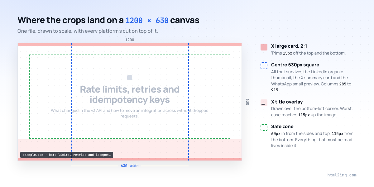
The same 1200×630 file goes through a different combination of those on every platform. The diagram below overlays the ones that matter.
## Platform by platform
### Facebook: the ratio everyone else copied
Facebook defined 1.91:1, so a 1200×630 image passes through untouched. The rules are the most generous of any platform: at least 600×315 to get the large card, 1200×630 recommended for high-density screens, up to 8MB. Below 600×315 the image still appears, but as a small thumbnail beside the text rather than a full-width card.
The mobile app scales the card to the width of the feed rather than cropping it, though it can shave a few pixels off each side. A 60px outer margin absorbs that.
### X: a 2:1 crop and a text overlay in the corner
X is the reason a safe zone exists. Two things happen to a 1200×630 image on the large card.
First, the crop. `summary_large_image` cards are 2:1, with a minimum of 300×157 and a maximum of 4096×4096 at up to 5MB. A 1200×630 image becomes 1200×600, which means 15px comes off the top and 15px off the bottom. Small, but a title that touches the top edge loses its ascenders.
Second, the overlay. Since October 2023 X has drawn the link's domain over the bottom-left corner of the card image instead of showing a title underneath it, and has since added the page title to the same corner. The overlay is rendered at a fixed pixel size, so on small clients it covers a larger share of the image. On the worst case measured in the community it takes up around 18% of the card height, so anything in the bottom 115px of the left side is at risk of being covered.
There is a third outcome if you skip the card tag. Without `twitter:card` set to `summary_large_image`, X falls back to the summary card: a 1:1 thumbnail cropped from the centre of your image. On a 1200×630 canvas that is the middle 630px, columns 285 to 915, and everything either side of it is gone. X's card validator no longer renders previews, so test with a real post or a DM to yourself.
If X matters more to you than the other platforms, serve a dedicated `twitter:image` built for the card type you want rather than letting X cut down the shared one. The [Twitter card generator](https://html2img.com/tools/twitter-card/) produces both the large card and the square summary thumbnail.
### LinkedIn: organic posts get a thumbnail whatever you do
LinkedIn's spec is 1.91:1 at 1200×627, over 200px wide (narrower images become a tiny thumbnail on the left), up to 5MB. The number that changes your design is not in the spec. Since May 2024, organic posts with an external link show a small thumbnail beside the headline rather than a full-width image. Sponsored posts still get the large card; reshare a sponsored post organically and it drops back to the thumbnail.
The thumbnail is centre-cropped to roughly square and rendered small enough that body text is unreadable. What survives is a colour, a logo mark and a headline of three or four large words. If the identifying element of your image sits at the left edge, LinkedIn readers never see it.
### WhatsApp: file size decides whether you get an image at all
Meta's own documentation for WhatsApp link previews asks for an `og:image` under 600KB, at least 300px wide, with an aspect ratio no wider than 4:1, and requires the `og:` tags to appear within the first 300KB of the HTML. In practice the community threshold is lower: images over 300KB regularly fail to load in previews on mobile data, and they fail silently. The preview renders with no image, the failure is cached on the device, and there is no debugger to clear it. The only workaround for a cached failure is a new URL, so a `?v=2` query string.
WhatsApp shows two layouts: a large preview with the image on top, and a small preview with a square thumbnail on the left. Which one you get depends on the image passing its checks, so treat the small square as a possible outcome and keep the centre recognisable.
Keep the file light. HTML to Image returns a PNG, and a flat design (solid fills, text, simple shapes) compresses to well under 300KB at 1200×630; the template later in this article renders to about 75KB. A full-bleed photograph or a noisy gradient does not. Check the byte size of the rendered file, not just the dimensions.
### Slack: scaled, never cropped, and small
Slack unfurls the image below the title at its original aspect ratio, scaled to around 360px wide on desktop and narrower on mobile. Nothing is cropped, but everything is a third of the size. Images that are already small are shown as a thumbnail to the right of the text instead.
The design consequence is contrast, not margins. A 24px subtitle at 1200px wide is 7px in Slack. Anything below about 40px on the canvas is decoration once the unfurl is rendered.
### Discord: a thumbnail unless you tell it otherwise
Discord defaults to an 80px thumbnail on the right of the embed. It switches to the large image, up to around 400px wide below the text, when it gets a signal that the image is the point: `twitter:card` set to `summary_large_image` is the reliable one, and landscape `og:image:width` and `og:image:height` values help it decide without fetching the file first. The large image is scaled to fit, not cropped, and the `theme-color` meta tag sets the coloured bar down the left edge of the embed. Nothing else reads that tag, so it is a cheap win for Discord-heavy communities.
### iMessage, Bluesky and the rest
iMessage reads `og:title` and `og:image`, shows the image full-width in the bubble, and requires HTTPS. The crop it applies has changed between iOS versions, with some releases trimming the card towards a squarer shape, and the sender's phone downloads the image directly, so heavy files fail on cellular the same way they do on WhatsApp.
Bluesky renders link cards at a fixed landscape ratio close to 1.91:1 and crops anything that does not match. Threads pulls from `og:image` and shows a similar wide card. The pattern holds across all of them: a 1.91:1 image with the important content in the centre survives; anything relying on the edges does not.
## The safe zone that survives all of them
Put the crops on top of each other and three rules fall out.
**Keep everything that must be read 60px in from every edge.** That clears X's 15px trim four times over, the few pixels mobile feeds shave off the sides, and the rounded corners most clients draw over the image.
**Keep the bottom 115px clear of anything that has to be read.** That is X's overlay band at its worst. Background, decoration and a quiet URL can live there; the headline cannot. Combined with the first rule, the readable area is 1080×455, from 60px to 1140px across and 60px to 515px down.
**Put the identifying element inside the centre 630px square.** Columns 285 to 915. That square is all a LinkedIn organic reader sees, all an X summary card shows, and all the WhatsApp small preview keeps. It does not need to hold the whole design. It needs to hold the thing that makes the card recognisable: the logo mark, the product shot, or a headline short enough to fit at 56px.
The cleanest way to satisfy all three at once is a centred composition with an empty bottom band, which is why so many well-tested OG images look the way they do. Left-aligned layouts can work, but only if the left-aligned element is decorative and the identifying element still sits in the middle.
## Build the guides into the template
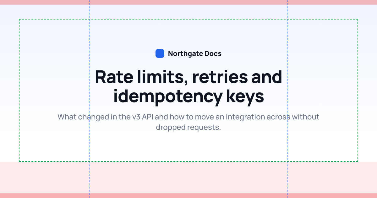
Rules on a page get forgotten. Rules in the template get enforced. This template centres the composition, caps the title width at the thumbnail square, and draws every crop line from the diagram when the body carries a `guides` class. Render with the class to check a design, remove it to ship.
```
Northgate Docs
Rate limits, retries and idempotency keys
What changed in the v3 API and how to move an integration across without dropped requests.
```
Rendered with the guides on, it looks like this. The title sits inside the blue square, nothing readable crosses the green frame, and the red band at the bottom is empty.
A short script renders either version. It reads the template, strips the `guides` class unless you ask for it, and posts the HTML to the [HTML to Image API](https://html2img.com/docs/parameters/html/) at the [viewport size](https://html2img.com/docs/parameters/dimensions/) of the card. Explicit `width` and `height` matter here: the default viewport is 1440×900, and a 1200×630 body inside it renders with a margin you did not design.
```
import { readFile } from 'node:fs/promises';
const template = await readFile('og.html', 'utf8');
const guides = process.argv.includes('--guides');
const html = guides ? template : template.replace('', '');
const res = await fetch('https://app.html2img.com/api/html', {
method: 'POST',
headers: {
'Content-Type': 'application/json',
'X-API-Key': process.env.HTML2IMG_KEY,
},
body: JSON.stringify({ html, width: 1200, height: 630 }),
});
const { url } = await res.json();
console.log(url);
```
Run it with `--guides` while you are designing, without once the layout passes. The production render is the same HTML minus one class, so what you checked is what ships. If you generate a card per page at build time, the [static site guide](https://html2img.com/articles/dynamic-og-images-in-astro-hugo-and-eleventy/) shows where this call fits in an Astro, Hugo or Eleventy build.
## Give the platforms the tags they use to decide
Two of the layouts above are chosen from your tags rather than your pixels. Discord and X both read `twitter:card`, and Discord uses the dimension tags to pick the large embed without downloading the image. The minimum block for a 1200×630 card is:
```
```
The [meta tag generator](https://html2img.com/tools/open-graph-meta-tags/) builds the full set with a live preview if you want the rest of the `og:` and `twitter:` properties filled in.
## Check all six previews before you share
The last step is looking at the card the way each platform will. Paste the URL into the [Open Graph checker](https://html2img.com/tools/open-graph-checker/) and it renders the Facebook, X, LinkedIn, Slack, Discord and WhatsApp previews from one fetch, so the LinkedIn thumbnail and the X overlay are visible before the post goes out rather than after. For a card that has already been shared with the old image, the platform caches still need clearing; the [troubleshooting guide](https://html2img.com/articles/og-image-not-showing/) walks through the Facebook and LinkedIn debuggers and the query-string trick for the platforms that have none.
One image at 1200×630, a 60px margin, an empty bottom band and the important part in the middle. That is the whole discipline, and once it is in the template you never have to think about it again.
---
Need Open Graph cards, certificates or invoices rendered from HTML without running a browser yourself? [Browse the templates gallery](https://html2img.com/templates/), start from the [Open Graph image template](https://html2img.com/templates/open-graph-image/), or [read the docs](https://html2img.com/docs/) to get started.